Soma
Creative WooCommerce Theme
Introduction
- Item Name : Soma - Creative WooCommerce Theme
- Item Version : v 1.0.0
- Author : neuronthemes
Welcome to documentation. First of all thanks for purchasing our theme. We hope you will be satisfied with our work, and this theme will be useful in your projects. If you need support or just want to say hi, drop us an email at neuronthemes@gmail.com.
This documentation is to help you regarding each step of customization. Please go through the documentation carefully to understand how this template is made and how to edit this properly.
Note: If image is not readable and is very small please enlarge them by clicking on it.
Getting Started #back to top
Installing Theme & Plugins - #top
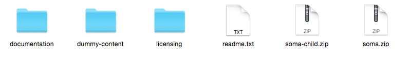
1 - Download the whole package at ThemeForest downloads.

2 - Extract all files of soma_package.
3 - Go to Appearance > Themes, press add new at the top.
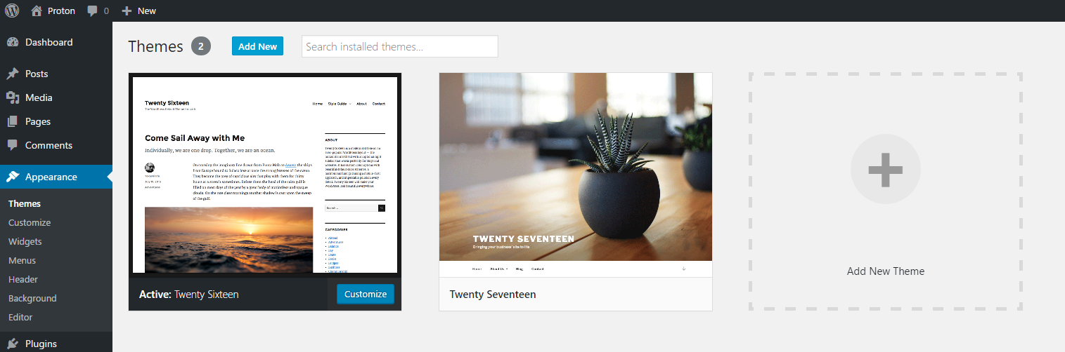
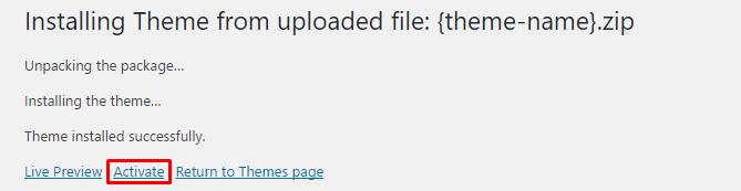
4 - Press Upload Theme and choose soma.zip.

5 - Press the link activate.
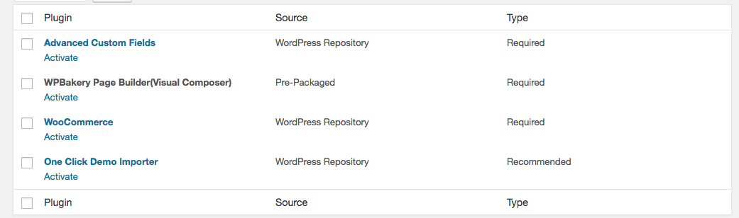
6 - Go to Appearance > Install Plugins, install and activate all required plugins.
- Advanced Custom Fields* - Is a key plugin for page settings and many more.
- WPBakery Page Builder (formerly Visual Composer)* - Is a page builder, very essential for creating pages and stuff.
- WooCommerce* - Is a key plugin for the shop, without WooCommerce the shop won't be able to work.
- One Click Demo Importer - Is a key plugin for demo import, incase you don't want to import the dummy demo, don't install this plugin.
Demo Importer - #top
1 - Go to Appearance > Import Demo Data and press Import Demo Data.

Menus - #top
If you used demo import, the menus are created automatically, if not proceed with the steps.
1 - Go to Appearance > Menus, press create a new menu and name it.
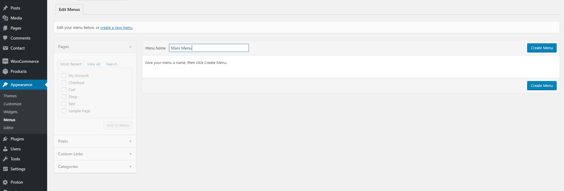
2 - Add your posts or pages into the menu then assign to Main Menu or Top Menu.

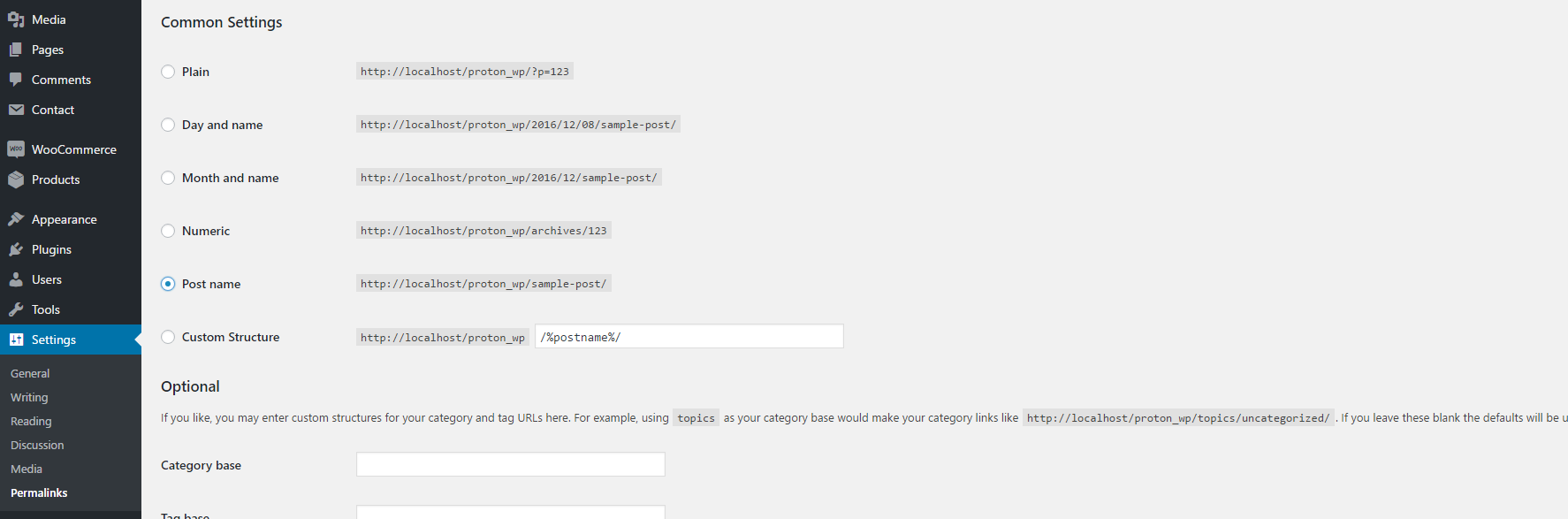
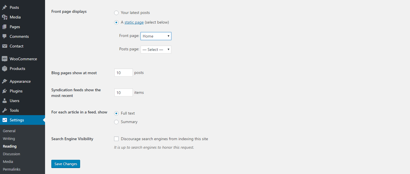
Permalinks & Front Page - #top
If you used demo import, the front page sets automatically, if not proceed with the steps below.
1 - To change permalinks of the website, navigate to Settings > Permalinks and pickup your most prefered one.
2 - To make the shop or any other page your homepage you have to go at Settings > Reading and choose it as front page.
Customizer #back to top
General Options - #top
Responsivity - You can disable the responsivity, which means with this option disabled your page will remain the same on small devices.
Custom Fields Panel - Enable the panel from Advanced Custom Fields, you'll be able to add your own custom fields from there.
Header Options - #top
Logo - Upload your logo in .png or .jpg format.
Logo Width & Logo Height - Change the logo width and height.
Logo Text - Incase you have not uploaded any image as logo, you can write up any logo text here.
Logo Text Size - Change the text logo font size, this option works only if you have text as logo.
Position - Change the position of header, absolute header will push the content to the top of browser.
Sticky - Make the header sticky, this means your header will stay fixed even if you scroll down.
Search - Show or hide the search in header.
Social Media - Show or hide the social media in header, do not forget to add the links on Theme Options > Social Media.
Social Media Type - Select between social media icons and social media text.
Social Media Style - Select the style of social media.
Footer Options - #top
Widgets - Enable Widgets in footer, you can edit the widgets in Appearance > Widgets.
Widgets Columns - Change the columns of widgets.
Social Media - Show or hide the social media in footer, do not forget to add the links on Theme Options > Social Media.
Social Media Type - Select between social media icons and social media text.
Social Media Style - Select the style of social media.
Shop Options - #top
Note: If you're not seeing these options, make sure to install and activate the plugin WooCommerce.
Type - Choose between two different layouts, when you select basic a new style will be applied to your shop page.
Columns - Select the columns of shop, default is 3 columns.
Sidebar - Show or hide the sidebar in shop, if you select show a new icon will appear close to breadcrumb which toggles the sidebar to open and close.
Breadcrumb - Show or hide the breadcrumb in shop, the breadcrumb let the client know in which page they actually are.
Result Count - Show or hide the result count in shop, this counts all the products on that page.
Orderby - Show or hide the orderby in shop, a multi dropdown which let's the user order by different choices the products in the page.
Offset - Enable or disable the offset layout, odd elements will get top spacing.
Spacing - Enable the spacing in shop, you'll be able to use the range input in the field below to change spacing between products.
Shadow - Show or hide products shadow in shop, the shadow means the border all around the product items.
Pagination - Select the pagination type of shop, the normal one is with numbers and arrows and the other one works with ajax via a show more button.
Initial Loading Animation - Select initial loading animation for products, with delay means the products will appear one by one with delay.
Blog Options - #top
Posts Per Page - Enter how many blog posts you want to display on the first page, if there are more posts than your submitted number the pagination will show up.
Columns - Select the columns of blog, default is 3 columns.
Sidebar - Select the alignment of blog or hide it.
Shadow - Show or hide posts shadow in blopg, the shadow means the border all around the shop post.
Pagination - Select the pagination type for blog, the normal one is with numbers and arrows and the other one works with ajax via a show more button.
Initial Loading Animation - Select initial loading animation for posts, with delay means the posts will appear one by one with delay.
Blog Single Options - #top
Navigation - Show or hide the navigation in blog single.
Navigation Category - Switch on if you want the posts to be navigated only in the same category.
Share - Select the type you want to display the share social media.
Social Media Options - #top
Enter the social media URL's, if you enable social media in a section, but you don't enter the URL here, that social media won't appear.
Visual Composer Elements
#back to top
We will list all the elements created by our team(NeuronElements), all other elements are default
Row (Extra Options) - #top
Left and Right Spacing - Select the left and right spacing of this row.
Top Spacing - Select the top spacing of this row.
Bottom Spacing - Select the bottom spacing of this row.
Alignment - Select the alignment of this row.
Blog - #top
Most of the options can be inherited from Theme Options directly.
Categories - Select the categories from where you want to get the posts from, if all is selected all posts will be displayed.
Posts Per Page - Write how many posts per page you want, default is 10. Enter -1 if you want to show them all.
Columns - Select the columns of Blog, default is one column.
Sidebar - Select the alignment of sidebar or hide it.
Shadow - Show or hide posts shadow in blog.
Metro - Activate the metro layout in blog, the column needs to be set individually for each post.
Pagination - Select the pagination type of shop, the normal one is with numbers and arrows and the other one works with ajax via a show more button.
Initial Loading Animation - Select initial loading animation for products, with delay means the products will appear one by one with delay.
Extra Class - Style particular content element differently - add a class name and refer to it in custom CSS.
Design Options - Add extra design to this element.
Social Media - #top
Type - Select between social media icons and social media text.
Style - Select the style of social media.
URL - Inherit the URL's from Theme Options or enter them only for this element, a new tab will appear right after selecting custom.
Extra Class - Style particular content element differently - add a class name and refer to it in custom CSS.
Design Options - Add extra design to this element.
About Me - #top
Image - Select between social media icons and social media text.
Title - Enter the title of the about member.
Subtitle - Enter the subtitle of the about member.
Description - Enter the description of the about member.
Alignment - Select the alignment of content, if selected left the image will be on the right and so on.
Extra Class - Style particular content element differently - add a class name and refer to it in custom CSS.
Design Options - Add extra design to this element.
Team Members - #top
Title - Enter the title, will appear on the left side.
Subtitle - Enter the subtitle, will appear on the left side.
Description - Enter the description, will appear on the left side..
Columns - Select the columns of team members.
Offset - Activate the offset layout, odd team members will get top spacing.
Background Color - Change the background color of team members holder.
Alignment - Select the alignment of content.
Shadow - Show or hide team members shadow.
Initial Loading Animation - Select initial loading animation for products, with delay means the team members will appear one by one with delay.
Extra Class - Style particular content element differently - add a class name and refer to it in custom CSS.
Design Options - Add extra design to this element.
Team Member
Image - Upload the image for this team member.
Title - Enter the title for this team member.
Subtitle - Enter the subtitle for this team member.
Social Media - Enter the social media links for this team member.
Button - #top
Link - Select the URL of button and the text that will appear as text of button.
Size - Select the size of button.
Fluid - Select if you want to the button to get the width of column.
Color - Select the style of button, or select a custom color, when selecting custom option a new field of colorpicker will appear.
Extra Class - Style particular content element differently - add a class name and refer to it in custom CSS.
Design Options - Add extra design to this element.
Service - #top
Icon - Select the icon pack of service, a new field below will appear that .
Title - Enter the title of service.
Content - Enter the content of this service.
Initial Loading Animation - Select initial loading animation for products, with delay means the team members will appear one by one with delay.
Data WOW Delay - Select if you want the elements to come with delay when initial loading animation is selected.
Extra Class - Style particular content element differently - add a class name and refer to it in custom CSS.
Design Options - Add extra design to this element.
Support Desk #back to top
Please remember you have purchased a very affordable theme and you have not paid for a full-time web design agency. Occasionally we will help with small tweaks, but these requests will be put on a lower priority due to their nature. Support is also 100% optional and we provide it for your connivence, so please be patient, polite and respectful.
Please visit our profile page or ask question neuronthemes@gmail.com
Support for my items includes:- * Responding to questions or problems regarding the item and its features
- * Fixing bugs and reported issues
- * Providing updates to ensure compatibility with new software versions
- * Customization and installation services
- * Support for third party software and plug-ins
- * Make sure your question is a valid Theme Issue and not a customization request.
- * Make sure you have read through the documentation and any related video guides before asking support on how to accomplish a task.
- * Make sure to double check the theme FAQs.
- * Try disabling any active plugins to make sure there isn't a conflict with a plugin. And if there is this way you can let us know.
- * If you have customized your theme and now have an issue, back-track to make sure you didn't make a mistake. If you have made changes and can't find the issue, please provide us with your changelog.
- * Almost 80% of the time we find that the solution to people's issues can be solved with a simple "Google Search". You might want to try that before seeking support. You might be able to fix the issue yourself much quicker than we can respond to your request.
- * Make sure to state the name of the theme you are having issues with when requesting support via ThemeForest.
Version History (Changelog) #back to top
Once again, thank you so much for purchasing this theme. As I said at the beginning, I'd be glad to help you if you have any questions relating to this theme. No guarantees, but I'll do my best to assist. If you have a more general question relating to the themes on ThemeForest, you might consider visiting the forums and asking your question in the "Item Discussion" section.
Changelog
                                   ----------------------------------------
                                    Version 1.0 - XX/XX/2018
                                   ----------------------------------------
                                   - Initial Release
If you liked our theme please leave us a rate with 5 stars, it would help us a lot.