We are all on the edge to give this year an end for good and hope to go into another year full of optimism and expectations for a brighter future ahead of us. It has been a long and exhausting year, filled with perplexed and mixed feelings and situations, ones that we haven’t dealt before.
The current pandemic situation has wrapped every aspect of our lives and it should be no surprise that even the prognosticators at Pantone, the leading color matching system that announces the color of the year annually, this time has decided to focus on giving a strong and enduring message rather than an intrinsic trend forecast like we’ve always been used to.
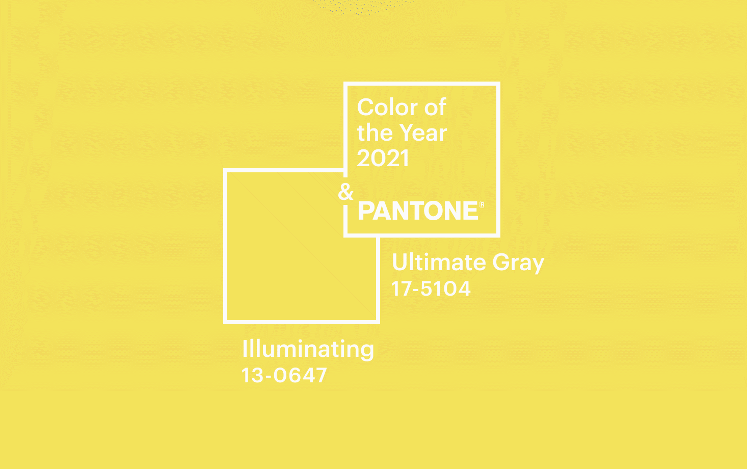
For this year Pantone has announced not one but two colors that together build a “marriage” conveying hope and optimism. We present to you PANTONE 17-5104 Ultimate Gray + PANTONE 13-0647 Illuminating. Both of the colors individually express a meaningful messages that when merged together give us the longing feeling of prospect and strength.
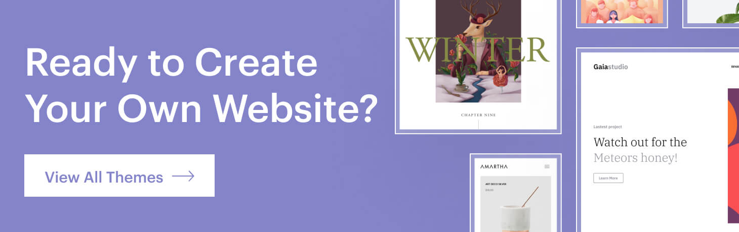
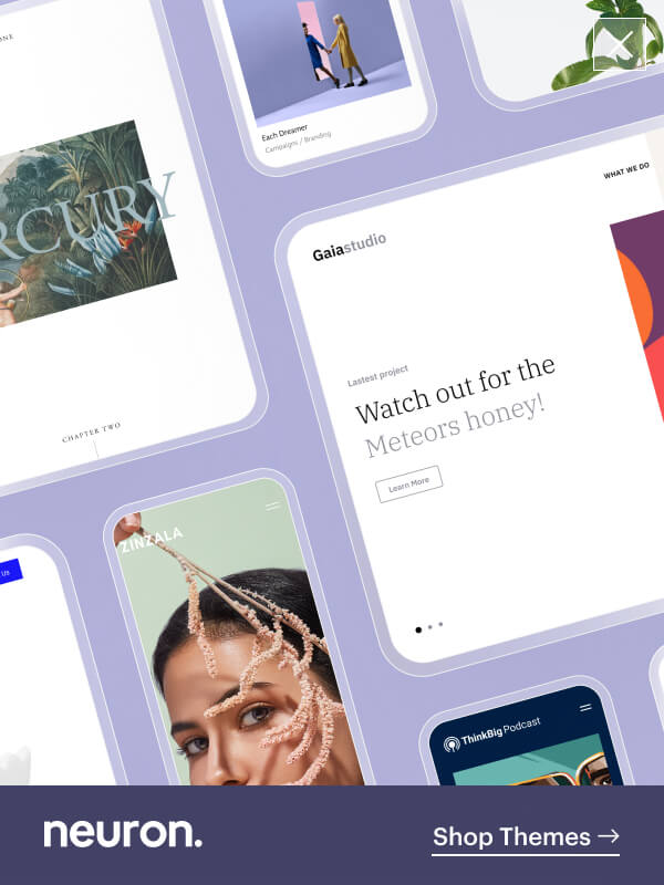
We shared our article on the Best Web Design Trends for 2020, and this time we shall give you the first glimpse of what’s new in website design.
What is the Pantone Color of the Year 2021?

With an upcoming new year, new resolutions and faiths and dreams behold in front of us, especially when face this quotidian uncertainty and ambiguity, this year, Pantone, the American color company decided prevail us from this state of enigma, but instead try and puzzle us out of this never-ending maze and guide us through the light at the end of the tunnel.
It was a quite long tunnel but, we also saw the state of contemplation that should serve us as a time to sit back and reminisce on how to move forward with new and improved visions. Moving past the Living Coral in 2019 and Classic Blue in 2020, this year’s duo of Ultimate Grey and Illuminating, was meant to be a metaphor for a brighter future for our entire society.
The stabile and practical shade of grey on par with a warming and optimistic yellow comes as a choice for the past year we all spent in quarantine swirled up on our monochromatic blankets enjoying a freshly juiced lemon tea.
“No one color could get across the meaning of the moment,” said Laurie Pressman, the vice president of the Pantone Color Institute on an interview for The New York Times.
Illuminating is a color of strength and idealism that encapsulates the true meaning a brighter future. This year’s color the year endures enlightenment, creativity, sunshine, and spring. Yellow is the most luminous color in the color spectrum. It’s the color of sunflowers, lemons, canaries, and bees. The Yellow color in almost every culture radiates warmth, happiness, and sunshine.

The Ultimate Grey on the other hand as the color f the year 2021 is meant to represent firmness and stability. The grey color is widely accepted as a neutral and balanced color, maybe it’s because it’s neither black or white, it’s right in the middle of these two defining colors and doesn’t point to an end. It represents a continuation of an indefinite period.
Both of the colors find use in various areas of design either web design, interior design, fashion, and more. Ultimate Grey is a timeless color that provides a grounding foundation and stability that we all need. The mere combination of these two colors as the “color of the year” is meant to put a dash of light on the mundane routine we are experiencing as a modern society.

The bright yellow shade as Pantone calls it Illuminating is meant to evoke the feeling of a fresh start full of sunshine when paired together with the lighter shade of Ultimate Grey that comprises of a composure, resilience, and consistency. The color of the year for 2021 is a joint correlacion to remind us of hopeful and promising times.
Pantone has picked two colors as the color of the year, as stated throughout the entire article, and in 22 years this is the second time the leading clor company has taken such step. The first time was the selection for the color of the year 2016.
A beautiful and captivating duo of Rose Quartz and Serenity were the highlight. But in 2016 the color of the year was meant to be a blend between the two colors only to provide us with a recognition in gender fluidity and social progress.
Distinctively this year the two colors are meant to complement each other, as they are two individual concepts on each of them, when put together give us the message of hope and aims for us to contemplate on the future with more grounding prospects.
The Pantone Color Institute are the trend forecasters that for the entire year they scouts and explores the world for finally come with a definition on the color of the year. that will dominate on many various areas.

Pantone Colors Through the Years
The Pantone Color of the Year is an annual inspiration that influences a wide range of design aspect starting from interior design to apparel, it truly inspires branding in every design industry.
The color selection from Pantone started in 2000, and every year the Institute conducts analytics and explores the development in various fields to come with one final color that translates ad the color of the year.
The color experts a Pantone scope the world aiming to find color influences, either from the entertainment industry, fashion, new technologies, materials, textures, and more. Let’s take a look down on memory lane and see the selection by Pantone for the color of the year.
Pantone Color of the Year 2020

The start of a new decade and for the color of the year 2020, Pantone went back to the basics this time. Classic Blue is a simple, familiar yet deep and meditative shade that is just as thought-provoking as the sky at dusk. The Classic Blue aim for a deeper contemplation, challenging us to think beyond the obvious and expand our horizons.
Instilling clam, confidence and connection, are the words Pantone used to describe the beautiful shade of Classic Blue as the color of the year for 2020. As a new era begins, we feel the need for a calming, stable, and dependable foundation.
In the year 2000 Pantone’s color of the year was Cerulean, also named the color of the millennium, was to represent the color of the sky shining bright, while the Classic Blue has darker tones emulating the color of the sky as the day ends.
Pantone Color of the Year 2019

For the year 2019 as the defining color was selected to PANTONE 16- 1546 Living Coal, a beautiful animated color hue that takes and undertone of gold that provides life, energy and evokes life-affirming intensity. Living Coral as the color of the year for 2019 imitates life in pursuit of happiness translated into a captivating shade.
Living Coral is a orange-based shade with a light and sweet undertone that transcends pure beauty. The decision for the color of the year 2029 by Pantone was highly influenced by branding efforts, especially, brands like Airbnb and Apple that used corlas in their branding and design as a sign of the color’s domination.
Living Coral is a color that represents warmth, nourishment, and shelter for the corals living under the sea as an indirect deployment of as the team of Pantone refers “authentic and immersive experiences that enable connection and intimacy”
Pantone Color of the Year 2018

In 2018 Pantone select a blue-based purple color that’s known for a more mysterious, dramatic, and imaginative shade inspired by our love of exploration of things out of our reach. Pantone’s color of the year 2018 was selected to be PANTONE 18-3838 Ultra Violet.
The outstanding color of Purple Violet was inspired by outer space as well as as a tribute to icons like David Bowie, Prince, and Jimi Hendrix that gave the color purple its importance. It is imperative that every year Pantone has chosen a color that represents the current cultural trends. A color to encapsulate the zeitgeist.
The color purple is transmitted to be deeply evocative and has always been associated with royalty, craftsmanship, wealth, complexity, power, and ambition. The color purple is not often seen in nature, but lavender, orchid, lilac, and violet flowers are considered delicate and precious.