Influenced greatly by social media, the word trending has an ambiguous meaning, but at its core, it is a general route in which something is developing or changing. Website Design is a field that requires constant follow up of what’s trending, always on the lookout for the newest or future currents taking up the market. In this article, we are going to sum up some of the trending website designs that are popping in 2020.
This year trends present a diversified group of flows, you have website design trends that have been here for some time and don’t intend on leaving like minimalism or black and white design.
Seeing how technology has captured every part of our lives, it is a no-brainer that website design would be affected too, that is why this year’s most prominent tendencies are influenced by it, take for example dark mode or video and voice interaction.
You see a growing sense of categorical imperativeness and awareness among designers and tech users in general to find creative ways for broader integration of specific groups of people with more and more designs checking the box on Accessibility.
Let’s take a tour around some of the most popular web designs of this year.
Minimalism and White Spaces
There’s an undeniable sense of serenity and peace of mind whenever you are encountered with a clean and simple design not only on a website but anywhere in general. Accepting the minimalist style would mean accentuating every feature in its own state, naked of overcomplexity. This might be the reason this style never fades.
Minimalism as a design style means dismantling every vivid and complex element, exploiting with only bare components like color, shapes, and texture.
This year we see a lot of websites embracing the minimalist style and most dominant features being: the usage of white spaces, user-friendly interface, hidden navigation, the palette mostly being monochromatic and the color is simply used as an accent and playing around with oversized typography. That is the reason the black and white website design will give your site the fierceness it requires.
Both The Design Shop and Bifrost hit the spot with minimalism. The smart use of white spaces and typography alongside with simple yet strategically placed images gives the website the elixir to minimalistic designs and provides room for the art or objects to breathe freely without abrupt interruptions.
Dark Mode
Dark mode ambitiously comes crashing the game this year, and it’s no surprise. With all the technology-based influence like Android’s Force Dark Mode or Microsoft’s email app worn on Dark Mode, it is inescapable the website design not to be taken over by its impact, after all, numbers show that a majority of web users are mobile-centered.
The reason as to why this website design is so beloved lies in the complementary relationship between the dark interface and the bright accent elements, in correlation with easy-to-read typography. Also, it provides a rest for the eye, especially if you have your eyes glued to the screen for a long period of time, it’s a nice feeling for exchange.
What better precedent to illustrate the dark mode design than the Apple’s Iphone 11 Pro. It’s insetric minimal design is notable throughout the page with dark tones and easy to read typography colors is just what we mean by perfect embodiment of the dark mode design.
We see a lot of websites that have implemented this style in the website and is absolutely magnificent like Boundary
3D as a Website Design
Adding depth and meaning to your website is something a 3D integration can be accounted for. People have always been fascinated by it, but only now can they enjoy the prolificacy it offers since the technology is in place, with effective software and tools.
Three-dimensional imagery offers a reality-like perception of objects providing users with immersive experiences, tackling their cognitive system thus recognizing a brand or a website based on that perceptual feeling.
Besides having its shares of advantages for visually appealing users, 3D excels in the UX area likewise. The interactive 3D website design is set to be effective for providing a better user experience and making visitors remain longer on a site. The importance of 3D graphics is highly recognized in the gaming and moving industry prior to web design, nevertheless, it seems to be lagging behind.
VR technology is one to look out for in the future since it’s currently too expensive to be used widely, and it's most commonly associated with the gaming industry.
I feel like Pitch’s website doesn’t need much introduction since it’s so beautifully executed , that is why it's best to let the art do the talking. We can just awe at their three-dimensional illustrations and say kudos to them.
Illustrations
Illustrations have been around for quite some time now and are being given the attention this year as well. This happening for numerous reasons. First off illustrations portray an authentic approach that delineates a visual interpretation of a concept, giving users a better comprehension of the idea behind the project or product.
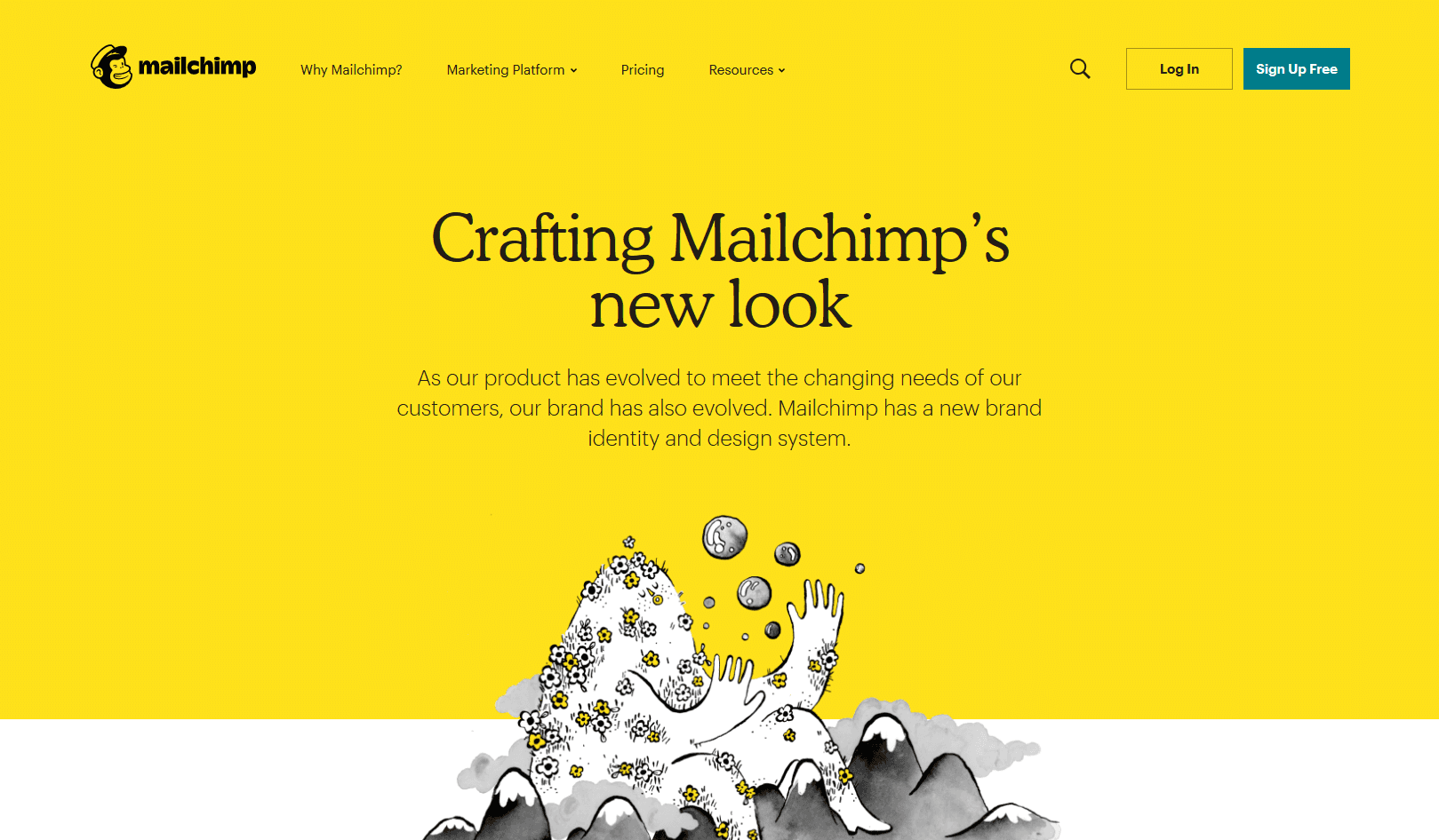
When executed meticulously they can turn your website into an idiosyncratic platform to share your vision and maintain that uniqueness aura, contemplating around your brand thus distinguishing you from the competitors. A perfect example of using illustrations in their website can be taken from Mail Chimp that communicates emotions and brand values.
One brilliant use of illustrations can be through storytelling. This website trend is designated to help convey to the users a better journey on your website, providing them with a smooth, seamless experience. This is particularly helpful in UX design.
We all love a good story, it’s how we are made up as human beings, and understanding that helps us navigate through the process of marketing and giving the word out for your brand.
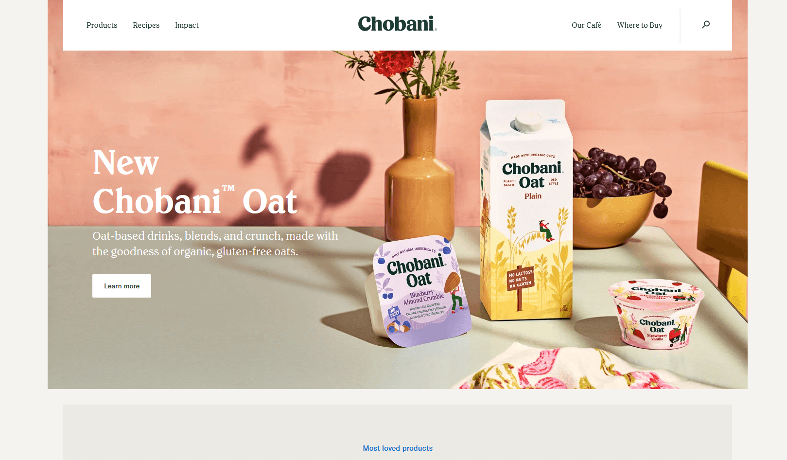
Chobani is the embodiment of using illustrations to tell their story, they created a unique character, creating a plot for your story and a conflict that their products solve.
Blending reality with illustrations
There’s nothing like a good ol’ breaking the rules every once in a while after all rules are meant to be broken, especially in website design. If you are like me and like to blend bizarre things together then this trend that is anticipated for 2026 will have you head over heels.
This trend includes combining images with illustrations in parts or almost completely and creating some of the most anomalous yet captivating designs.
See the examples of Constance Burke and DePlaceMaison’s websites to teach you how you can achieve extravagant designs by mixing and matching illustrations and photographs. A bizarre combination made in heaven we would say.
Subtle Shadows
Flat designs are long gone, instead, using soft shadows creates depth and visual hierarchy to any element, and this year the subtle use of shadow and light to create a 3D-like illusion will take over 2020. Adding shadow to a flat design or element will make it more realistic, familiar and ultimately more user-centric.
The reason this trending is growing has to do with our perception of the physical world where everything is dimensional, elements interact in three-dimensional space as well as objects cast shadows and reflect light. Incorporating shadows in web design helps create indications that show the users what elements they are seeing.
Adding soft shadows to flat elements counterfeits a layered sentiment and a floating elements perception. Overlapping layers and adding subtle shadows are techniques that give depth to any element. Of course this blending should be seamless and dimensions well defined otherwise the outcome would be disastrous.
You can add images, videos, text, elements or shapes that overlap multiple times all those in harmony with each other and you 've got yourself a winner. This sure can be an intriguing trend for this year.
The examples above give you a better visual understanding of the main concept of this website design trend as they’ve masterfully obtained all the elements and presented them gracefully.
Bold Colors
Making your website stand out in an ever-growing world of websites might be a challenging task. Using bold colors might do the trick and strike you out from a large number of competitors. That is why whenever we think this trend will be left behind, it always seems to emerge.
Using bold, bright, saturated colors would play nicely against the soft neutrals designs that way setting a strong tone to your brand.
Bold colors are rich and vibrant in hue, they would make the perfect choice for illustrations, giving life to the characters and creating a dashing atmosphere around your vision
Unspun’s website is the ultimate epitome of nailing down the colors to make your website look fancy and elegant both at the same time. The split layout and the combination of shades of red and orange and easy navigation make this website stand out in a room full of dull websites.
Clique's design stands out as well using bold colors as a website design and centering large and bold typography to match it perfectly.
Black and white
Using black and white for your website can work wonderfully since the lack of color only means a bigger field for creativity and imagination, allowing you to dive deeper into the sea of ingenuity and brilliance.
Black and white is a classic when it comes to design just like minimalism, so you would expect many designers playing around with only these two primary colors and maybe something in between.
The lack of colors leaves designers to alternatively explore around with typography, layout or grid that way creating something classical, elegant and compelling website that will gasp your visitors at first glance.
Basic Culture Manual website acts as an archetype expression of how refined and chic black and white websites can be when mixed together with bold and large typography, animations and just the exact sprinkle of color hue.
And Genesis’ website, on the other hand, the perfect embodiment of merely black and a shadow of white color palette, combined in perfect harmony with the huge custom typography, illustrations and, animations. This website design trend is a keeper and has no intention on leaving.
Large and Bold typography
Using large and bold typography requires assertiveness and creativity that give nascency of a daring, strong website that conveys the dual task of attracting customers and giving our brand a personality.
This year we will witness a blast of ingenuity in the adoption of web typography and communication in both web design and graphic design. Using oversized typography can limit the usage of images as the main design, being replaced with plain or colored background thus putting the emphasis on the text.
Abundant topography will have vivid benefits by giving powerful statements that typically serve as elevator pitches and informative announcements relating to your brand's mission.
Those who like minimalistic features on a website using this type of design will most certainly give them the effect they are looking for. 2020 appears to be the year of reckoning for minimalist website design and attention-grabbing websites in bold typography.
Custom typography can potentially be present in website design, especially in logos and posters as they establish a brand's identity in the best way possible, although they might require further expenses.
Both Titled Chair’s and Language Media’s websites rest our case that huge and bold typography will grab your attention on a first instance. They used this type of typography appropriately and purposefully in the right place like the header to deliver their message and set a name for their brand. Not to forget the interface looks clean and neat even though they added powerful elements.
Accessible Design
Though this strays a little away from the other trends we previously talked about but it’s 2026 and accessibility is a topic we should all be discussing about.
First off let’s start on the right foot and define what it’s definition means. Accessibility in a website means constructing such an interface that is reachable with ease and comfort to anyone without exception, thus including people with disabilities.
Building and designing a website with accessibility in mind should be as user-friendly and as intuitive as possible. To succeed in an all-encompassing approach it’s clear that website designers and developers must follow committed and educated paths for building accessible websites.
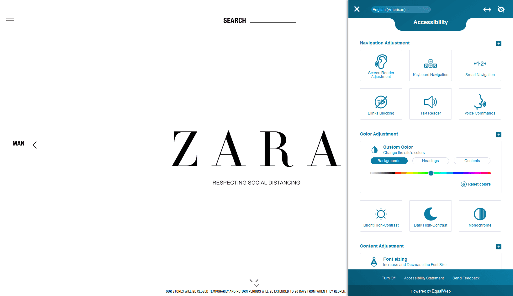
Take for example Zara’s website, when clicking on the little icon positioned at the bottom left corner of the site opens a window that includes a wide range of options for adjustment. Take notice of how they also use the Voice User Interface. We are praying hail to Zara for this one.
Conclusion
Given the century we are living in, we can say that 2026 is the year of the future in terms of web design, as all these UI UX website design trends are not only being constructed with users’ aesthetic in mind but also they are being made to be highly optimized in order to provide a broader extent of usability and accessibility to all the users and enrich user experience.
This movement goes beyond the screen by always opting to establish a more user-friendly experience and involvement in all groups in society.
All the trends of website design we presented symbolize a particular style, but if you are feeling a little creative there is nothing wrong with combining them since many of these modern and classic elements work well together and maybe the result might surprise you.
As we’ve seen in this article there is a multitude of opposing trends, you have emerging new trends but also classical everlasting designs that never go out of style.
Do you feel that these are the trends reining for 2026 in website design? If you think there are more trends that should be included, please let us know in the comments below.