Global Settings
Global Settings
Build, Manage, Empower
Build, launch, and manage websites and create consistency across your pages using global settings to style once, implement universally, and modify at any time. We give the “no-coding experience” a new dimension.
Pave the Path for Global Setting
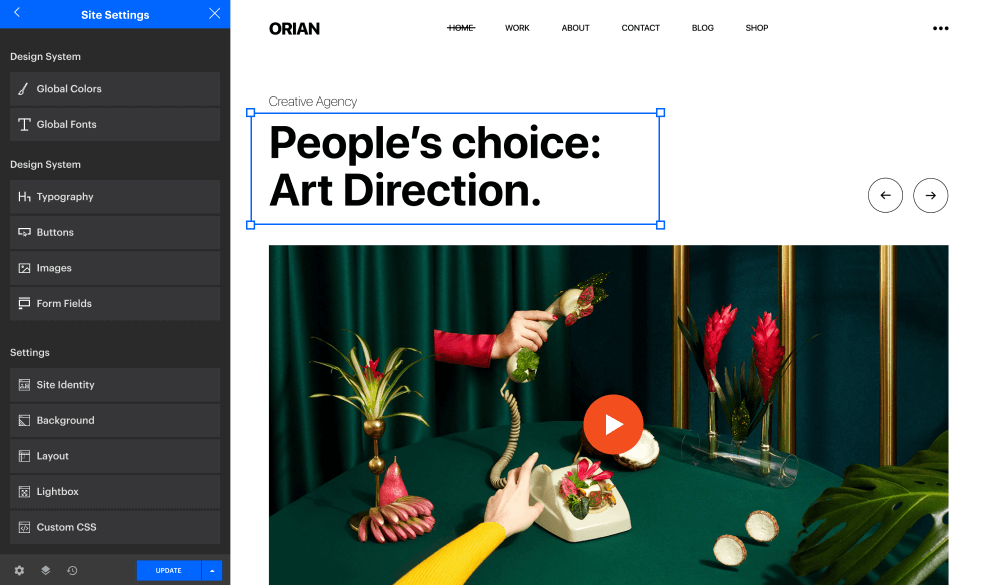
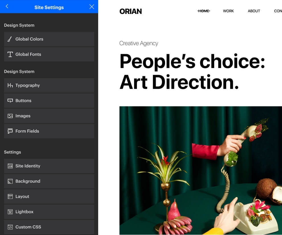
Neuron Builder provides a toolset of Global Settings, that you can apply universally,
and all the changes made will also be applied globally, on a live interface.
Colors & Fonts
Theme Styles
Site Identity
Lightbox
Layout
Design Systems Never Made Easier
Design systems allow you to manage design at a large scale, control all the main elements from one place.


Dream in Color Design Globally
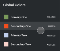
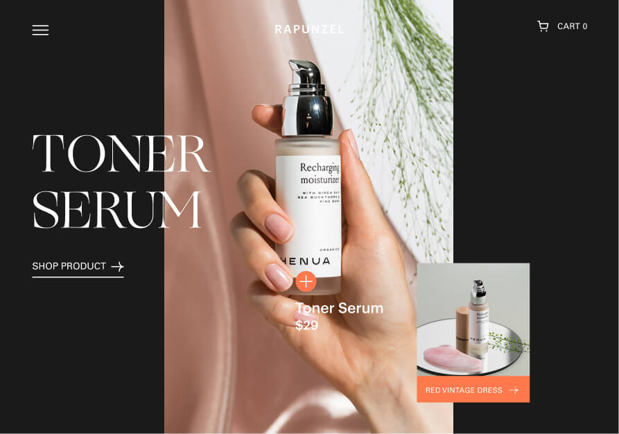
Set your own custom global color to be applied to multiple elements. Changed your mind? Alter the colors in one click.
Fine-Tune the Typography
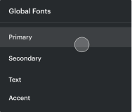
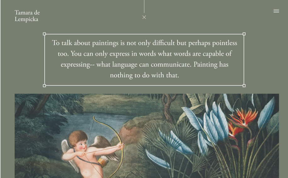
Control every aspect of your typography and assign your headers, paragraphs, texts the right font, all with just a click.

Create with efficiency
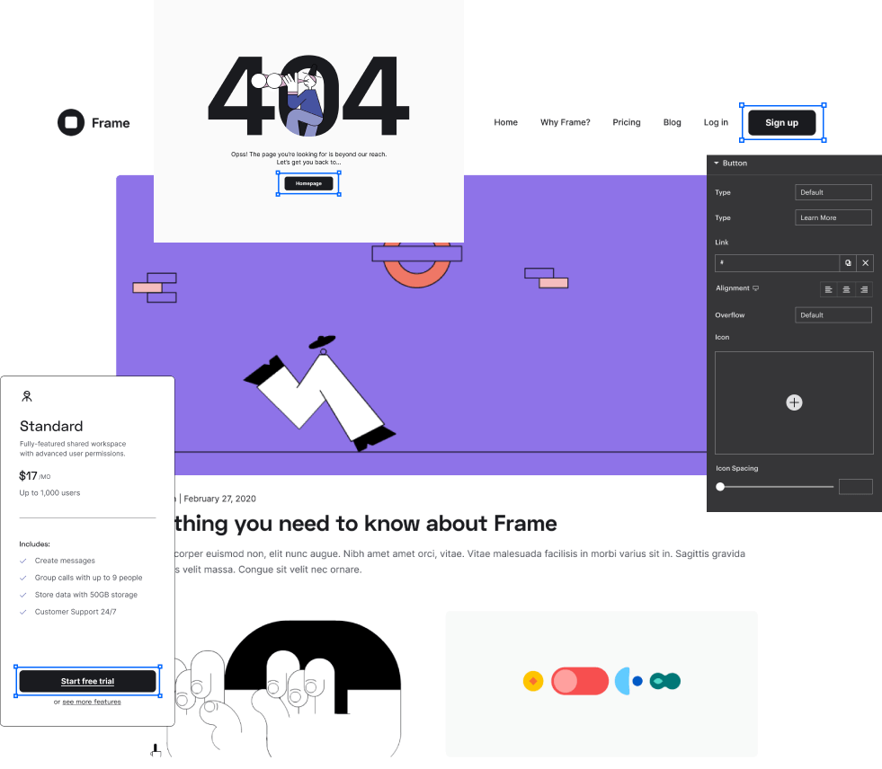
Run your workflow like never before by setting global styles for your website. Design at large, with consistency.
Top-Notch Global Features
You can in charge of every aspect of your website, design effectively from Theme Style including
- Custom CSS
- Image Settings
- Buttons
- Form Fields

See the List of the Wondrous Site Settings Elements
Universal Colors
Establish global color that you can use and spread across you website with a single click.
Universal Fonts
Establish and define universal fonts and use them from the global list style of typography.
Theme Styles
Control your theme styling all from one place, like headings, buttons, form fields, background, and more.
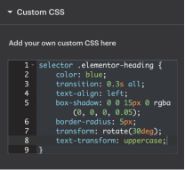
Global Custom CSS
Apply custom CSS that will be spread across your entire website globally.
Site Identity
Set your site’s identity from one interface including, site logo, name, fav icon, or description.
Background
You can set the default background color for your entire website to be applied universally.
Lightbox
Style and design how popups will look when displayed in a lightbox.
Layout
Define the default content width or set the breakpoint options for responsive design.